Not the best title for a post but had to put that pun in somewhere! Finally we hauled the extremely heavisome ceramic mug printing machine to the farmhouse. Our factory in nearby Gouzon was too cold and we still have a tonne of work to insulate the printing studio. Choosing what project to prioritize and trying avoid too much travelling, especially as Macron has placed a 6pm curfew upon us, it made sense to move the mountain to Mohammed. Evenings are long and after a few years of accumulating design portfolios we wanted to start 2021 with a positive and get the machine up and in service. It’s the learning curve stage too, and a few niggles to iron out like ink tones, design constraints and image quality.
We always find commercial print companies push the ink hues too red. This machine did the same. Designing for mugs is also tricky. Just slapping a picture on the front doesn’t work. I love Emma Bridgewaters designs and she chooses very specific tones and layouts to achieve her country styles. I have ordered two of her chicken mugs to see the competition. Expensive at just over £22.00 each! But she is famous enough to push the profits higher. Me, once I have resolved the colour issues, can work my designs up specifically to fit and I am enjoying designing groups of mugs, sets of six to eight.
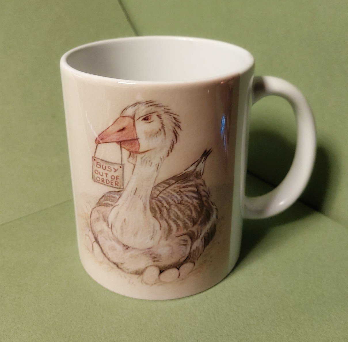
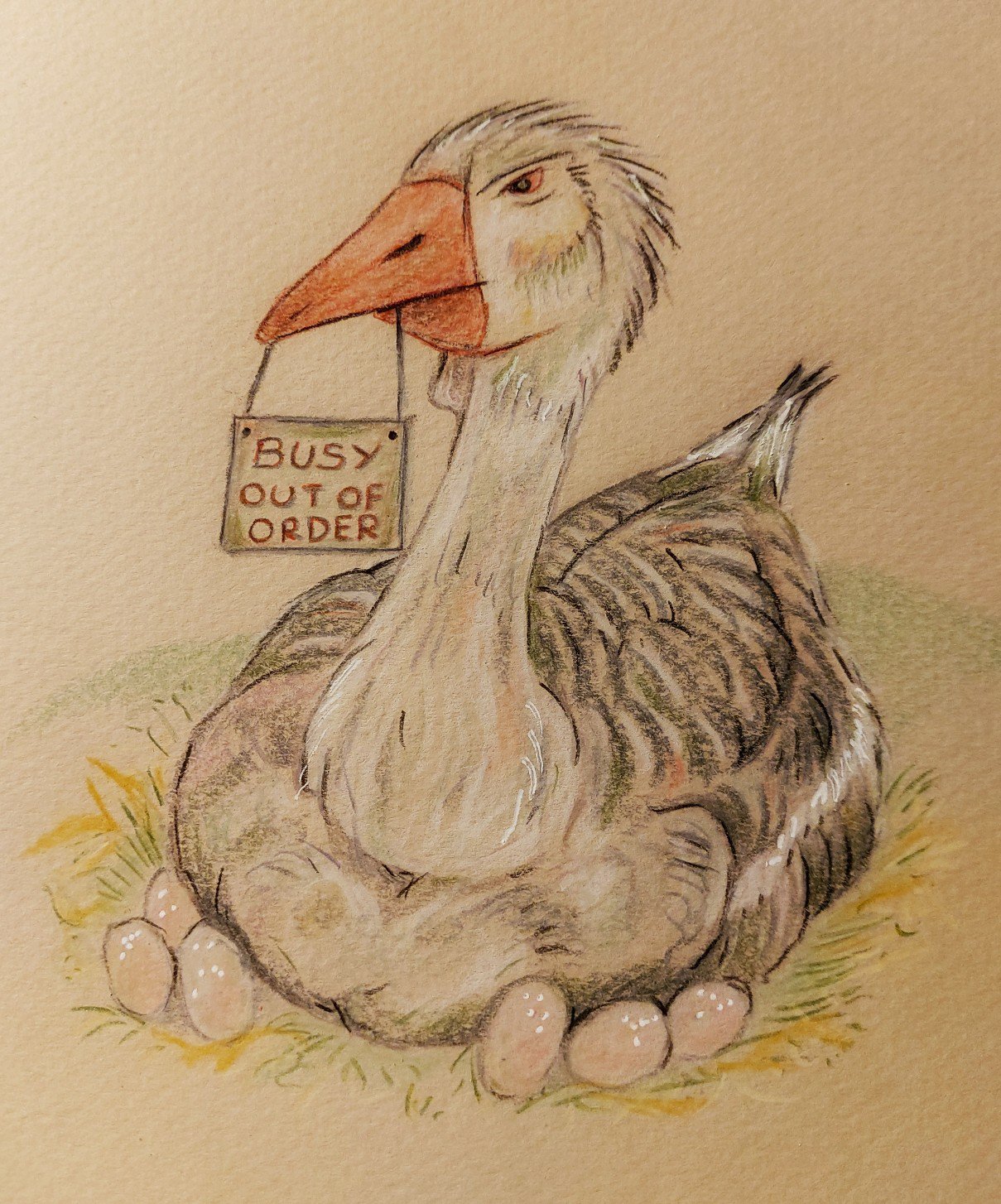
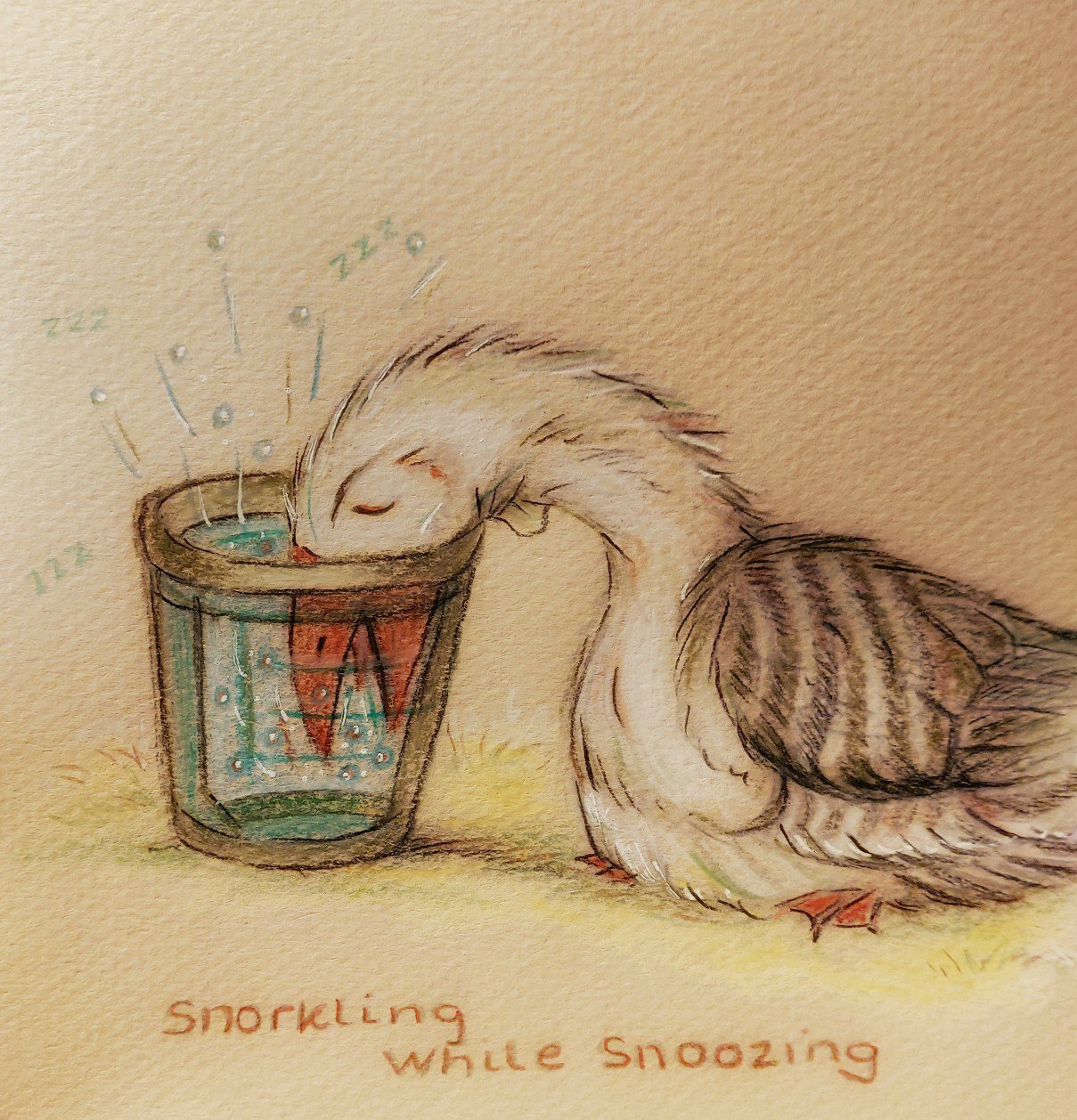
I researched geese designs. Most had typography of cliche sayings, like ‘You’ve cooked your goose’, ok they are amusing but hardly going to stand out. Tonnes of copyright free clip art used and inappropriate designs that were lost due to size constraints with bad detail or too much negative space.
There are thousands of amazing pieces of artwork on Behance, Pinterest etc but never found on ceramics. I understand the designs may not work but it seems more that without your own machine you have to rely on commercial print companies and you have a large cost upfront and no design controls. We had huge issues a few years ago trying to get manufacturers in UK to print our small glass perfume phials. In the end we had to give up. China could do runs of twenty thousand, far too costly for a startup and the prototypes we were receiving back were terrible. Tones wrong, stencils mismatched, missing printing and runs. We moved on. But the seed of ideas were sown.
The retailers too are also cautious about accepting any novice designers, but their caution has produced a shop full of similar designs that has saturated the market…Orla Kiery pulled out a couple of years ago, realizing her designs were everywhere. The magic was gone. Return to the Chateau renovator, Angel, upset many fan buyers when the original designs hit the high street, starting out at the department stores at £65 for a cushion, but after six months, Tescos were flogging them at less than £20.00! She made her money but there was a bitter taste left in many supporters mouths.
There is also complacency. Once your design is out on social media there is a tonne of promoting to do. No media will sell your designs miraculously as they appear. Not On The High Street started with a commendable ideal of selling small, local artisan products. Profits climbed and the moral stance slid rapidly away. Now there are absolutely thousands of generic products, many produced by Chinese firms masquerading as European. Designs get lost in the noise of mediocrity and ease of getting to market. A far different marketing plan is needed. For one thing the Covid-19 has been positive. The fall of retail was long due. They had grown lazy and customer service was low. On-line needed a pep. People worried about post costs, packaging design but the reality is now, consumers just want the armchair ordering convenience and the product to arrive undamaged. Its enabled designers to almost work on a similar platform with retail shops muscling in, but it’s still very hard to get noticed. Our foray into retail was fraught with arrogant shop owners, just as I found publishing houses to be. Self publishing now is a recognized route to market. The vanity publishing issues are being removed and would be writers and illustrators understand the competition. A book that would take three years to market can be out in public domain in six months. The public decide your fate. Better than a payrolled publishing house with a criteria based on 32 pages of all colour, non-rhyming text. The irony is that Donaldson badly rhymes but she is in the business. That’s a problem. So to avoid getting political I only have to say, get out there, learn the networks and you have more opportunities that before, pushing against a swathe of institutionalized traditions.
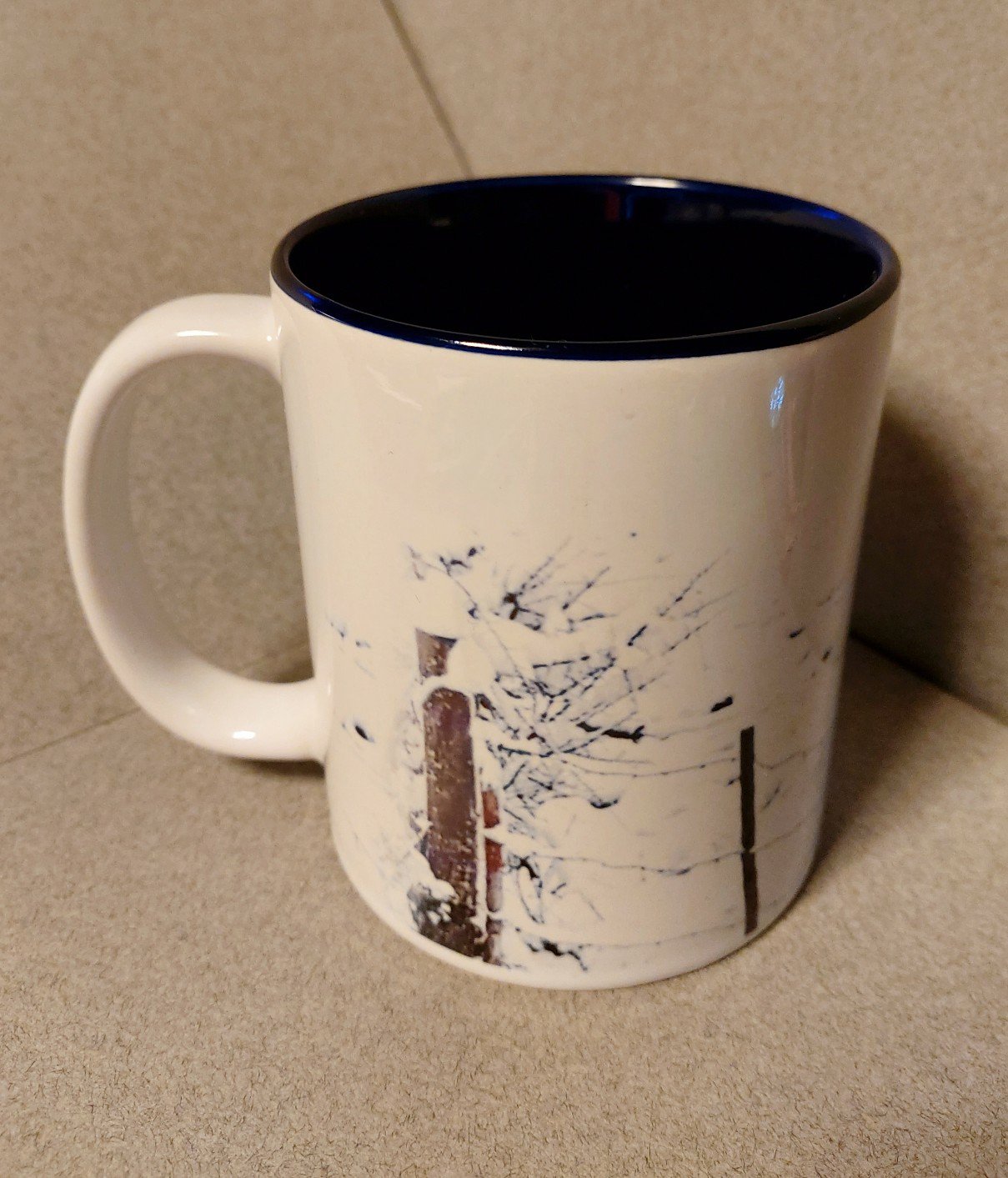
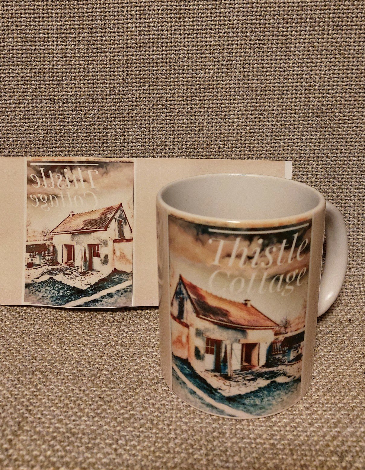
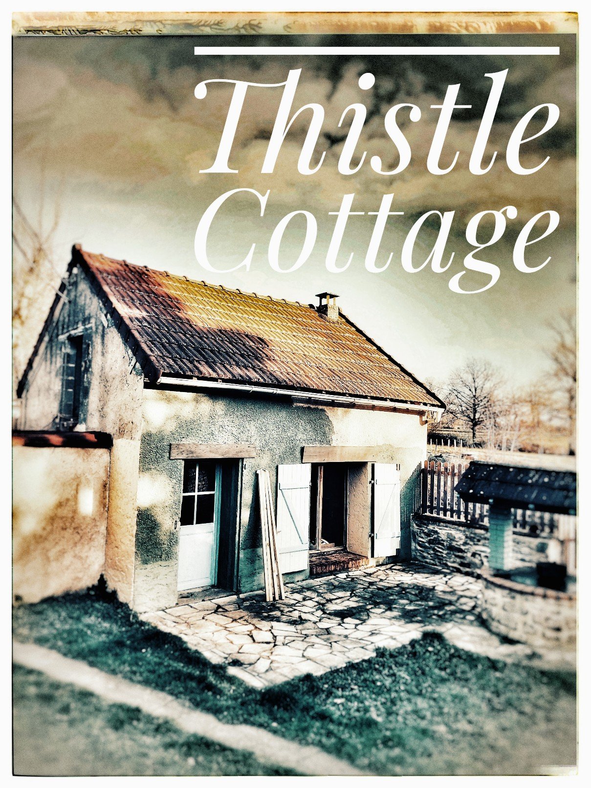
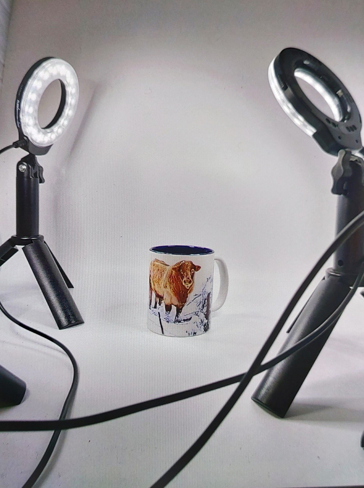
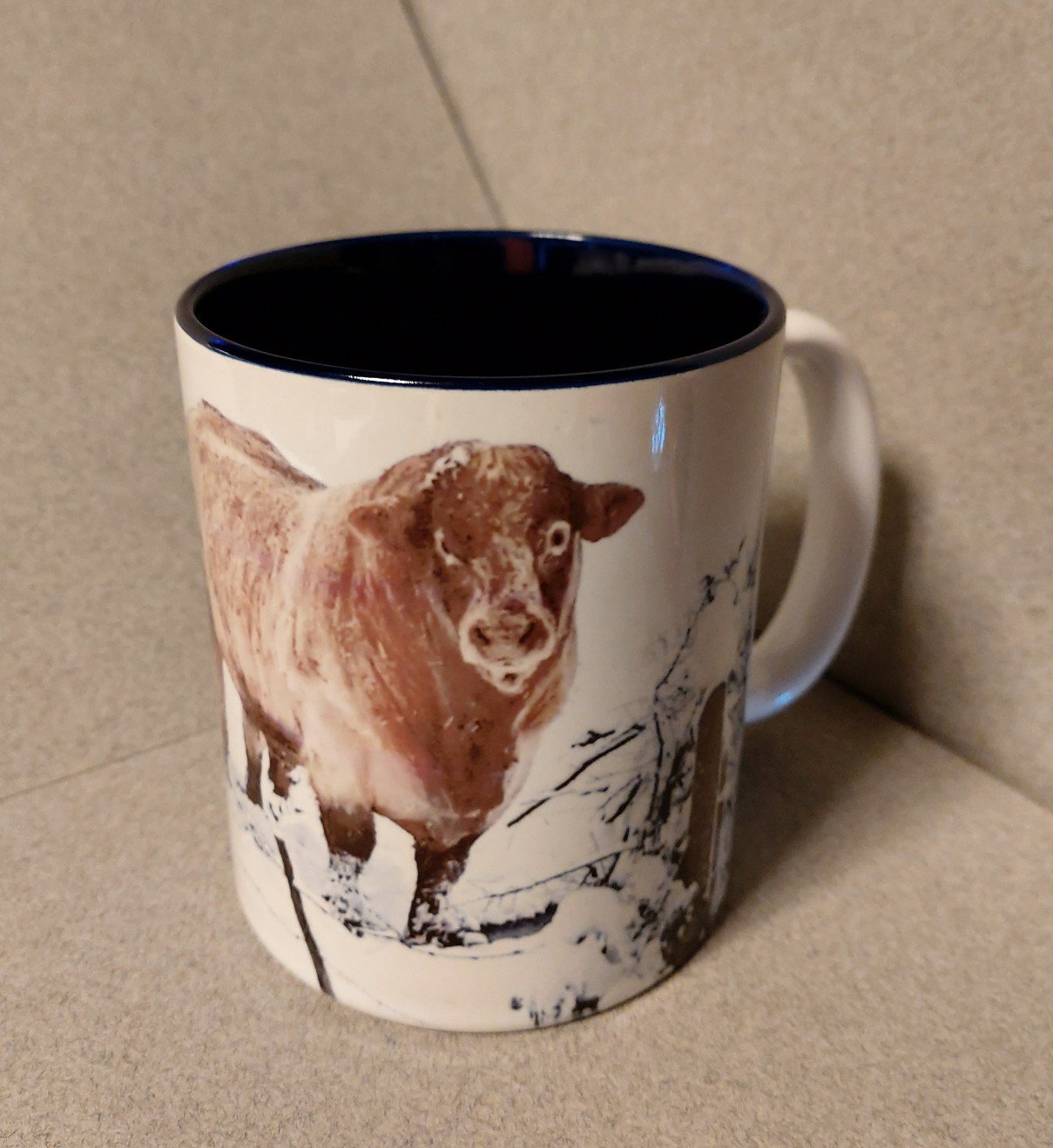
Now in 2021 the machine is up and running. The first runs produced a great finish, smooth and clear. The tones need adjusting but its workable with photoshop and myself carefully controlling my colour palette from the start. Thinking mug design from go will also help…position, boarders, size, impact of colour or wording. I downloaded a couple of ceramic courses too and it’s kind of good to get my teeth into a viable project at last and not just paint for painting sake.
Here are the first runs. We still need to decide which style of mug, the start glazed they have and a few software issues to iron out, like scanning the designs, adjusting any colour hues and whether to produce continual horizontal images or combine two seperate but complimentary ones. Lots to learn but fun.